
Modern businesses must navigate through a vast range of risks, whether it’s the IT department avoiding hacks or the financial department minimizing the threat of recession.
While senior management may understand the importance of Enterprise Risk Management (ERM), companies struggle communicating its value to stakeholders, often resulting in poor or uninformed decisions. This is where the visualization of risk prevention data is key.

Prioritizing risks
Risks are rarely of equal importance. Prioritizing them will give your ERM a focus, meaning risks can be mitigated quicker through more informed decision making.
When judging the priority of a potential risk, you should consider two questions:
- What is the probability of occurrence?
- What is the level of impact should it occur?
Based on those two answers, you should be able to rank each risk. To communicate your analysis, visualization is vital and very easy to implement. The most widely-recognized way would be using a traffic light system. This is so widely known you shouldn’t even need a key or legend. It is generally accepted that red is bad/stop and green is good/go.
Example: International SOS – Interactive Travel Risk Map
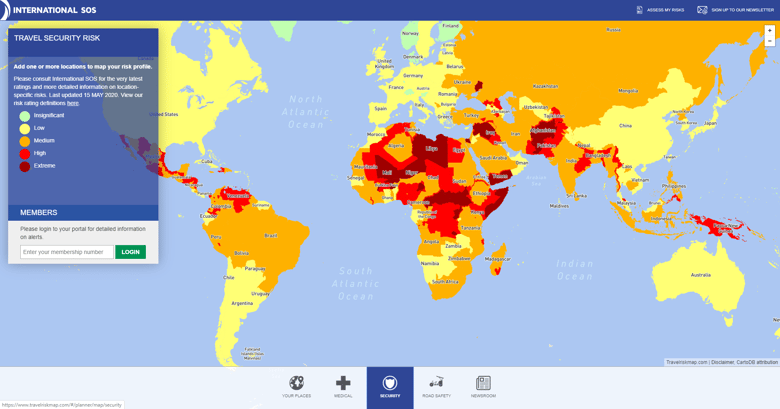
In the example above, International SOS took this simple concept and applied it to their interactive map of travel risk. Its visual appeal and in-depth data resulted in International SOS being short-listed for the ‘Innovation Through Technology’ award at the Institute of Risk Management Awards.
Highlight clear relationships
The power of using data to drive good business decisions combined with the ability to provide the right information, to the right people, at the right time, has helped Network Rail to win two industry awards in 2019, both for Best Use of Technology in Risk Management, using SharpCloud for Enterprise Risk Visualization.
Understanding the context of risks can help stakeholders digest the complex data, enabling them to see the bigger picture. Helen Hunter-Jones, Head of Group Risk at Network Rail highlighted the importance of "visualizing the strength of relationships between risks and projects”.
Example: SharpCloud - Bow-Tie Template
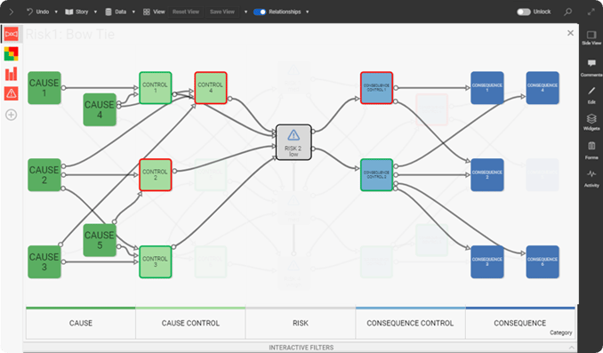
The Risk BowTie diagram example above demonstrates the bow-tie method. Arguably the best method to highlight the interdependencies between risks in a simple visual explanation.
The BowTie design gives a brief overview of the current situation, outlining all plausible scenarios by highlighting the flow of cause, control, and consequences. The shape of the diagram helps distinguish the proactive and reactive elements of risk management.
Start working with this template
Communicate relative risk
A risk on its own is unlikely to spur change. But knowing you are in more danger than others, can. This is called relative risk. At the Data Visualization Summit in Boston, Nicholas Arcolano, Senior Data Scientist at TrueMotion, explained the importance of visualizing risk:
“Visualization helps counteract our cognitive biases by allowing us to explore complex causes and effects"
Examples: TrueMotion's GradeMyDrive – Visualizing Driving Risks
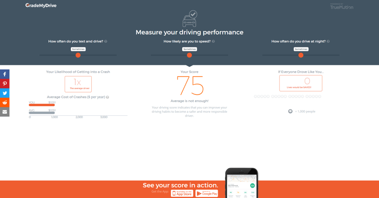
More specific to TrueMotion, who deal with the hazards of dangerous driving, was the difficulty in dealing with people’s ‘availability heuristic’, the idea that people, in a driving context, believe they will never crash because they haven’t already. They aimed to counteract this, and highlight relative risk, in their interactive visualization platform, GradeMyDrive.
This puts the dangers into perspective, while making it visually engaging for users. The methodology can be transformed for a business context by taking simple principles, such as highlighting relative risk and conveying dangers that have never occured, and putting them into your ERM.
Be dynamic and data-rich
Example: SharpCloud – Enterprise Risk Portfolio Demo
Static risk visualizations, like the bow-tie approach shown earlier, can be a good way to represent a brief overview of a current situation. However, for a more comprehensive ERM, a more in-depth approach is needed. Dynamic risk management software allow users to dive in and out of data at will.
By bringing your data to life, you can use your risk management portfolio as an effective communication and presentation tool to engage stakeholders and empower better decision making.
With a scalable system, you can map out your entire strategy, showing the relationship and interdependencies within your data to understand the ramifications of each approach...essentially filter out the noise and make informed decisions, all in one place.
Keep it current
Using digital platforms for your ERM allows you to continuously monitor activity, make comments and implement changes if needed. As it's a centralized piece of content, it’s important that your ERM is always up-to-date.
Example: Kapersky Cyber threat real-time map
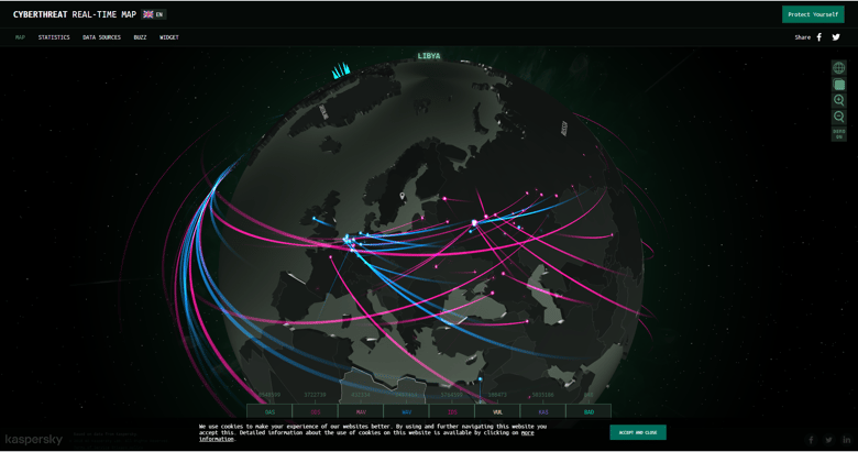
This interactive map from Kapersky, is a great example of how data can be brought to life. Their map of Cyber threat never stops updating itself, presenting the viewer with engaging and relevant data 24 hours a day. Of course, most risks don’t need to be updated as frequently, this really depends on the nature of risk you are dealing with.
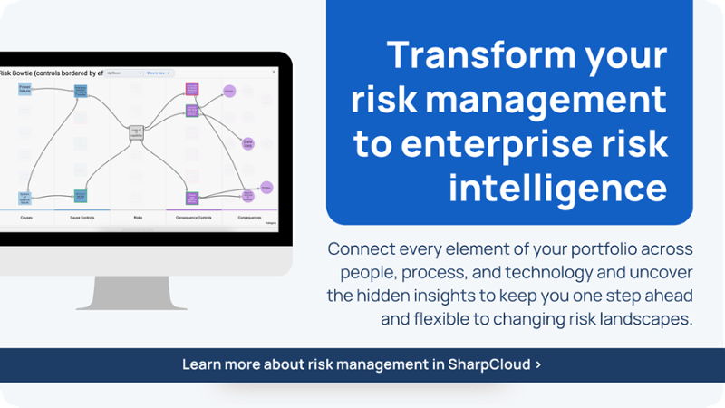
Bring your risk data to life
When using SharpCloud software, your risk management portfolio also becomes an effective communication, collaboration, and presentation tool.
You can create a shared understanding of priorities and analyze your data with views that help you filter out the noise and focus on answering crucial strategic business questions.