
Managers, team leaders and employees alike can all experience difficulty presenting - not only do you need to compile data and summarize your presentation into something meaningful, but it’s also important to present the information in an organized and digestible way.
Knowing how to present ideas to your boss is a difficult task, especially when trying to present complex data in a way that is easy for leadership to understand. Monthly reporting templates can help, but understanding the fundamentals of what to focus on and how to present to your boss will bring it all together.
Tips on how to present to your boss
Identify Your Audience & Objective
The first step in presenting monthly reports is to identify who you'll be presenting the report to and what your objective is. You should also consider who else may be present during the presentation, such as other members of the executive team or key stakeholders.
Knowing who your audience and stakeholders are will help you tailor the content of the report and focus on the key points that need highlighting for each group. Additionally, it can help you determine which data points are most relevant and how best to display them during the presentation.
The tool you use to present your information has a huge impact on what you include in it, what you are able to present to an audience and what happens to it after it’s been presented.
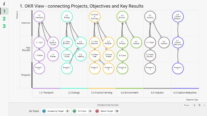
If your objective of the presentation revolves around personal/team OKRs and KPIs, take a look at our free template to get an idea of the information you're going to want to have available.
Tip: The best presentation software is non-linear, providing the user with the flexibility to explore data through a variety of views. The presenter can choose the view that provides the most insight for the participants and audience, encouraging interaction.
- A dynamic, flexible presentation is able to change and adapt to different circumstances when required, stimulating productive conversations, engaging audience members, and encouraging creative thinking.
Be Concise
Making sure that your monthly reports hit home with leadership is essential. When compiling your report, keep it as concise as possible. Too much data can overwhelm leadership and make it difficult for them to accurately assess what is going on within the organization.
Instead, focus on the most important points and try to highlight those points clearly so that they stand out. Try not to include too many extraneous details; instead, focus on the core metrics that will help leadership assess how well your team is performing each month.
Tip: Customization helps to introduce aspects such as rich media, data-driven infographics, and automation into your presentation to provide a much more captivating experience for your audience.
- Communicate a prioritized ‘big picture’ that visualizes every dependency and its impact, with the ability to drill down into detail when required, giving context to the content. Take your audience on a journey through your presentation with customizable data views and highlight key issues.
Make It Visual
Organizing your data is key when presenting monthly reports. Not only does this make it easier for leadership to quickly find the information they are looking for, but it also provides an opportunity for you to highlight any areas of success or concern that may require additional attention from management.
If you're presenting a lot of data-heavy content, consider using visuals such as graphs or charts instead of long tables of text or numbers—this will help illustrate any trends or patterns in the data that might otherwise go unnoticed.
.svg)
Tip: Software solutions must be able to integrate, process, and display visuals correctly to increase the value of the presentation and enable the audience to better understand ideas and insights.
- Visuals can make complex information easier to understand at a glance, enabling leaders and stakeholders alike to quickly absorb important details without getting bogged down by long-winded or uneccessary explanations.
Data Driven
Some of the biggest presentation pitfalls occur because of the misuse of data. Providing inaccurate information will put doubt into the mind of the audience about the thoroughness, precision, and professionalism of the presentation.
Utilizing data reliably enhances arguments and decisions, gives the audience context, and enables more informed decision-making.
Tip: The best presentation software can create a presentation that is data-driven and automated, communicating surprising trends, relationships, and insight to the audience that would otherwise be unapparent, while saving time and reducing human error.
- Uncover hidden insight, identify and explore relationships, visualize timelines and create better transparency across the business.
Presentation Matters
The presentation of your report matters just as much as the content itself. Some of the biggest presentation pitfalls are down to simple human error. A non-functioning slide or damaged infographic will put doubt into the mind of your audience about the thoroughness, precision and professionalism of your work. Unexpected questions can also catch you off guard and interrupt your flow, forcing you to frantically search for the relevant documentation on the spot.
Tip: The best presentation software can handle an abundance of content and data, no matter its complexity, length, or size. A failure to display high-quality visual elements, animation, or video without lag can leave the audience underwhelmed.
- The capability to drill-down into specific points and expand content further will ensure a shared understanding of the necessary facts and information to keep discussion moving and productive, and provides the participants with all the information they require to make important decisions there and then.
Collaborative Creation and Delivery
Collaboration on a presentation can give rise to natural and more effective decision-making. The ability to invite participants to view, comment on, and co-create a presentation helps ensure continuous development, and also heightens attention-to-detail, increasing the precision of delivery.
Encouraging audience interaction during delivery can also help transform meetings into dynamic decision-making forums and keeps the audience engaged and focused.
Tip: Software solutions must be able to facilitate effective collaboration with ideally an unlimited number of participants, making it possible to deliver a higher quality presentation while enhancing the communication of the collaborators.
- Share ideas and opinions, encourage discussion and debate, and naturally steer decision makers to draw the "right" conclusion for themselves.
- Adapt and flow with the course of the discussion - open conversations between stakeholders may result in a more collaborative organizational culture.
Monthly reporting can be a daunting task for managers and team leaders but with proper preparation and organization, it doesn’t have to be overwhelming or time-consuming. By following these tips, you can ensure that you are presenting accurate, digestible information in an organized and professional manner so that leadership can easily assess how well their team is performing each month.
With clear communication between teams and management alike, successful organizations rely on monthly reports as an essential tool for keeping everyone informed about their progress towards organizational goals!
No more monthly report writing
The need for more interesting styles of flexible data driven dynamic presentations is obvious! At SharpCloud, we focus on decisions, not just design. Our software not only creates presentations, but can also manage your project, or project portfolio, from start to finish. This means that setting up your presentation becomes a coherent part of your workflow, rather than a separate task.
SharpCloud automatically produces visually rich interactive presentations that keep audiences engaged. Make changes to the data as you present, or take the time to delve deeper into your story as questions arise. Thanks to embedded images, video, documents, and discussion, users can tell the story behind issues while providing a visually inspiring and interactive experience.
What's more, your data-driven SharpCloud story updates automatically and seamlessly, keeping your presentation up-to-date and equipped with the latest information throughout.