
In our world of increasing amounts of data, the need for data-driven decision making is growing. Data is a powerful tool for making informed decisions, but raw data alone can be overwhelming and challenging to interpret. This is where data storytelling comes into play. Being able to effectively tell stories with data will help to inform better decision making and give you an edge and set you apart from others. It's the difference between showing data and storytelling with data.
According to Forbes
"Many bold, incredible insights will be ignored if they are not successfully molded into data stories. Uncovering key insights is one skill and communicating them is another - both are equally critical to deriving value from the data your business is now amassing."
To maximize the potential that data has to offer, the goal is to make it easy for anyone in the organization to access the key metrics and insights they need to make better decisions. The most common way of sharing data with employees has been through dashboards and reports.
- In a recent survey of 500 executives and data professionals, Exasol found that 82% of respondents reported “regularly using dashboards to share and communicate insights with colleagues at every level of the business.” Unfortunately, more than half (53%) also reported that dashboards were often disregarded due to the time it took to interpret them.
- At the organizations that struggled with using dashboards effectively, respondents indicated the top drawbacks with dashboards were inadequate context (61%), information overload (54%), and a lack of customization to individual user needs (46%).
Put simply, data in dashboards and spreadsheets only tell you what is happening, but not why. They lack the vital component of narrative or context for effectively communicating information and insights.
Storytelling with data
According to Gartner, data storytelling will be the most widespread means of consuming analytics by 2025. In addition, by then a full 75% of data stories will be automatically generated using augmented intelligence and machine learning rather than generated by data analysts.
What is data storytelling?
Data storytelling is the art of translating complex data into a compelling narrative. It involves combining data analysis and visualization techniques with storytelling principles to convey insights, trends, or patterns in a meaningful and engaging way that resonates with your audience and inspires action.
Data storytelling can be used internally, for example, to communicate the need for product improvements based on user data, or externally to create a compelling case for buying your product to potential customers.
Why is data storytelling important?
Data storytelling is important because it allows for the effective communication of data. When data analysis is communicated effectively, it can improve decision-making, reinforcing your working relationship with your team, stakeholders, and clients.
Data storytelling is designed to inform and engage, making business content more interesting and memorable - it's seen as the most effective way to share business information to a wide range of audiences and drive outcomes.
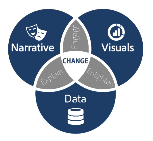
Key components to data storytelling
- Data: Thorough analysis of accurate, complete data is the foundation of your data story. Analyzing data using descriptive, diagnostic, predictive, and prescriptive analysis can enable you to understand its full picture.
- Narrative: A verbal or written narrative, also called a storyline, is used to communicate and explain insights gleaned from data, why a particular insight is important, the context surrounding it, and actions you recommend and aim to inspire in your audience.
- Visualizations: Visual representations of your data and narrative, such as charts, graphs, diagrams, pictures, or videos, can be useful for communicating its story clearly and memorably and enlightening the audience with insights. Many interesting patterns and outliers in the data would remain hidden in the rows and columns of spreadsheets without the help of data visualizations.
The combination of the right visuals and narrative with the right data will produce an engaging data story that can influence and drive change. If an insight isn’t understood and isn’t compelling, no one will act on it and no change will occur. Data storytelling bridges the gap between obtaining insights and interpreting them.
How to tell a story with data effectively
1. Identify your story - questions will help you uncover your story.
- What are you trying to explain?- What are your goals?
- Are you trying to get buy-in from stakeholders?
Look for connections between your data, interesting or unexpected relationships can provide the basis for your story and help you to draw comparisons. Another thing to look out for is trends, such as any changes in growth of a particular product or service. New or changing trends could be crucial for understanding how the company should react. Pay attention to data that surprises you or doesn't behave as you'd expect it to and ask yourself why. Some of the most compelling stories are those that are unexpected.
2. Be aware of your audience - if the story you want to tell isn’t relevant or interesting to your intended audience, it won’t have the impact you want.
- Who is your audience and is this story relevant?- Does it solve a problem they care about or provide needed insight?
- Have they heard this story before?
Customize your story - different audiences will require different stories whether it's more in depth detail or high level takeaways.
3. Build your narrative - with your data in hand and your audience in mind, you can start developing a narrative.
- Who are you talking to?- What do you want your audience to know or do?
- How can you use your data to make your point?
A good data story should take your audience on a journey with context at the beginning around the situation and why you are telling this story. Then move onto the problem and how can it be solved, placing the emphasis on value and what will be gained. Save the good stuff for the end!
Read our Introduction to Business Storytelling, it has everything you need to know to start telling great business stories.
Data stories vs. data visualizations
Data stories and visualizations are connected but distinct.
- Data visualization is simply a visual representation of information.
- Data stories connect the audience with the data.
- Data visualizations support and enhance data stories, helping you communicate your findings efficiently and effectively.
Communicating your point to an audience whether it be presenting to the board, reporting on risks, and projects, or visualizing your strategy roadmap, an effective data visualization can be the difference between success and failure. Effective visualization helps makes complex data more accessible, understandable, and usable.
![Risk Management Views overlay[7897]](https://www.sharpcloud.com/hs-fs/hubfs/Risk%20Management%20Views%20overlay%5B7897%5D.png?width=2480&name=Risk%20Management%20Views%20overlay%5B7897%5D.png)
Being able to clearly visualize and communicate insights and how they relate to future or ongoing projects or the business as a whole are all key to achieving success. Presenting data visually using charts, plots, infographics, and even animations helps to communicate complex data relationships and uncover surprising trends and data-driven insight that wouldn’t be apparent from looking at stats alone.
Interactive data visualization
Infographics will help to clarify what you are presenting but better still is an interactive visual – one that displays the high level information and then enables you to explore the complexities of relationships, interdependencies, and timelines and drill down further to supporting information and resources.
No longer would you be constricted to the traditional linear method of business storytelling, but instead, an interactive story that enhances interpretability and drives discussions. Visuals keep things moving, they engage and add authenticity to your business story.
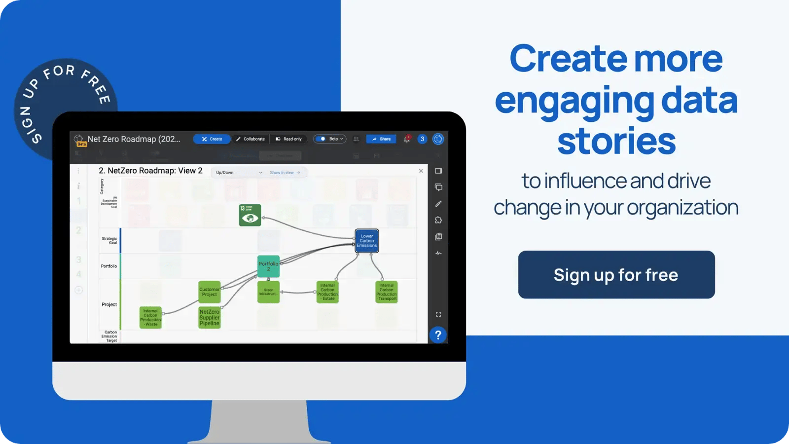
Data storytelling with SharpCloud
SharpCloud was created to help businesses communicate and collaborate around their complex projects and initiatives to facilitate informed decision-making. SharpCloud retains the ease of use that you enjoy in PowerPoint but provides powerful ways to visualize, navigate, and truly understand interconnected information.
- Free your data (within minutes you can drop the contents of your Excel spreadsheet into a SharpCloud story) and visually display it in a connected, interactive SharpCloud story that enhances interpretability and uncovers the hidden insights and gaps between strategy and execution.
- You can easily create and customize different views of your data to explain key findings and ideas and enjoy greater visibility by connecting story items and exploring how they interact with and impact each other. Interactive filtering gives you the ability to focus on what matters right now, improving productivity in meetings without losing sight of the wider strategy.
- You're free to add images, videos, and text to story items, or embed documents straight from SharePoint for example. This adds context and lets you communicate important information fast and in one central place. Your chosen collaborators can comment on any story item or relationship, @tag relevant people, and send out targeted notifications.
- And when it's time to present your story to others, you can build your dynamic presentation right inside of SharpCloud. Create simple, intuitive dashboards that make accessing your data and exploring your stories easy and engaging. And when the data changes your presentation is automatically updated - no more copying and pasting from Excel to PowerPoint - you've created a single source of truth.
- The audience is active, involved, and stimulated - the story has been delivered to them and designed specifically for them and as a result, knowledge transfer is higher.
Example story
By gathering information from different data sources in one place, SharpCloud users can quickly create and explore powerful 'stories' that can be used as dynamic presentations, strategic roadmaps, or project portfolios.
Critical information may be lost without data storytelling and more importantly, data not encased in story form may not inspire action and change. Our customers are augmenting their line of business tools with SharpCloud to more clearly navigate and communicate the complexity and make better informed decisions.
- Enhancing Organizational Agility: Find out how SharpCloud can help your organization become more responsive and adaptable to changes, a key factor in today's fast-paced business environment.
- Revolutionizing Management Strategies: Discover how SharpCloud can transform your program and innovation management strategies, allowing you to make data-driven decisions that align with your business goals.
- Creating Dynamic Roadmaps: Learn to create insightful roadmaps that highlight risks and tie strategy to your program management initiatives. This can help you anticipate challenges, optimize resources, and keep your projects on track.